Jewelry and craft magazines love themes. It does make it easier for editorial staff to organize content. Readers seem to love too, as it is fascinating to see variations on a theme all grouped together. As a jewelry designer, I like the idea of working with themes. Rather than seeing it as restrictive, I see it as a challenge: How can you put a personal twist on a theme and still have it ring true?
What Is Southwestern Jewelry?
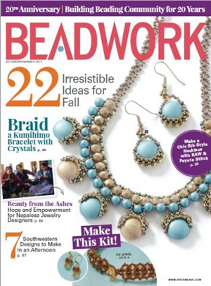
The theme for the "Fast and Fabulous" section of the October/November 2017 issue of Beadwork was Southwestern jewelry. Color suggestions were given (red, turquoise, brown), but no other specific limitations. An old article titled "Make Southwest Style Jewelry" on the publisher's website suggested specific color combinations of turquoise and silver, turquoise and red, or brown and blues. (I was surprised to see my Copper Cowgirl necklace listed in the examples. That's one of my earliest magazine designs from 2007 if you want to see where I started.)
The features that I associate with this style (primarily from looking in shop windows in Santa Fe, New Mexico) are bold/statement necklaces, lots of turquoise, dark brown leather, occasional red accents, and lots of bright silver.
A Few Examples of Southwestern Jewelry
Looking over some of my older handmade jewelry designs, here are a couple that I could say could fall into this theme: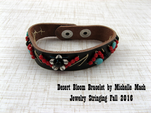
My Desert Bloom bracelet appeared in the Fall 2016 issue of Jewelry Stringing. This bracelet combines the standard turquoise, red, and silver colors with a touch of black. I think the hand stitching and the thicker leather cuff also fit this theme well. You can read more about it in the original blog post.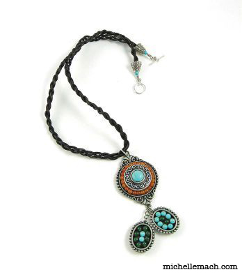
My Turquoise Ranch necklace is an affordable design I made using Bead Gallery beads from Michaels. The use of the braided leather, the turquoise beads and the almost bolo tie pendant shape say "Southwestern" to me. I did use touches of green, which is not characteristic. I think if I were to make this design today I might have gone full steam ahead with just turquoise in the two small oval bezels.
A Design That Isn't Southwestern, But Could Easily Be Transformed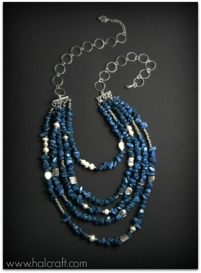
This blue chip necklace, on the other hand, I wouldn't classify as Southwestern because the colors are not right. However, if I substituted turquoise chips for the dark blue chips, it would fit the theme nicely. It's definitely a bold statement necklace, which is one of the features I associate with Southwestern jewelry. I think the same silver beads and large chain would look great in a turquoise version. (A step-by-step tutorial with photos is available if you want to make something similar.)
An Early Version of a Southwestern Necklace
My jewelry design experience has taught me that there is a balance between keeping true to a specific style or theme and going completely your own way. So for my Beadwork necklace, I wanted to see just how far I could twist some basic parameters (bold statement, turquoise, silver) and still have at least a tentative connection to the Southwestern jewelry theme.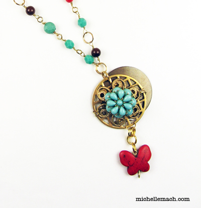
My first attempt (which I did not submit to the magazine) used the requisite colors, but I changed "bold" to "delicate" and "silver" to "gold." I liked this necklace quite a bit, but it no longer felt "Southwest" to me. I felt like the pendant in particular had moved this necklace into a different theme altogether. The pendant in any necklace does draw the viewer's eye, so any changes there can have a larger impact than other parts of the necklace.
I set it aside for a bit and decided that I needed to tweak the pendant, rethinking the fussy wirewrapping and the modern-looking gold circle background.
My Final Version
Here was my next attempt (and the one that appears in the magazine):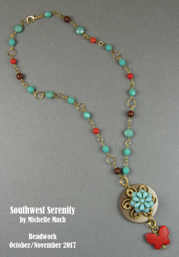
Nature (flowers and butterflies) aren't particularly associated with the Southwest, but I felt like adding those elements did not completely remove the design from the Southwest theme. It's a matter of balance. Going overboard on these elements (adding a floral clasp or ten butterfly dangles) would tip the design too far.
Removing the gold filigree would have likely made a stronger Southwestern connection, but there was a matter of practicality at play: I needed some kind of background piece to connect the turquoise flower to the antiqued brass circle blank. And to be completely honest, I did not have time in my schedule to seek out a different kind of connector before the magazine's deadline. Sometimes you make design decisions and sometimes they are made for you!
Also In This Issue
In the October/November 2017 issue of Beadwork, I wrote a short article for the last page of the magazine (Bead Buzz) about the women in Nepal who are making and selling jewelry to rebuild their village after a devastating earthquake. So inspiring! I really enjoyed writing this piece. You can check out their project at Langtang Designs.