B is for Basic, Beautiful, and . . . Boring?
Recently I had a comment on an old blog post I wrote about an essay I'd read. To recap, it's easy to make jewelry, but it's difficult to make something that isn't overly complicated, but isn't boring either. And that's so true. (By the way, the author of the essay wrote in and shared a link to her jewelry designs, in case you want to check them out.)
The conversation had me thinking again about simple vs. boring. I wrote about this topic on Beading Daily a couple of years ago ("Why Simple Designs Aren't Always Simple to Make"), so obviously it's a topic that rings true to me.
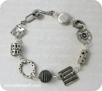
In Best of Creative Jewelry, I have a Silver Linings bracelet which exemplifies the "simple vs. boring" idea. This is a monochromatic bracelet, meaning the parts are all the same color: silver. It's mostly sterling silver, though there is one pure silver bead (made from PMC) and a gunmetal round. It's the kind of "every day" piece that you could easily wear.
Design Tips
I looked at my bracelet and came up with some reasons that I think it works:
- Bead Size. The beads all fall within a certain size range. I don't have any tiny beads or supersized ones. This has more to do with comfort and wearability, but I also think it makes the bracelet look balanced.
- Limited Shapes. I've limited the shapes to mostly circles and squares, with a couple of cylinders. The shape theme follows through not just on the shape of the beads, but the texture on them as well. Notice the circle patterns (polka dots), stripes, and squares. So even though the beads look "one of a kind," you can see they all relate to at least one other bead in some way.
- Light/Dark. Even though the color palette is silver, there is some variation in dark/light. And there is definitely more variation in texture, which you notice more since there are no colors to distract you. (And yes, I know that I need to polish some of the sterling in this bracelet!)
- No Repetition. Every bead is unique. The only repetitive elements are the ones that are made to blend in the background: the jump rings and wired links. (If you're a fiction writer, think of these elements like the word "said" in dialogue. No one will notice it if done right.)
Simple vs. boring. What's your view?